LOOK BOOK
Role: UI/UX
LOOK BOOK
Year
Year
Year
2022
=
TOOLS: ADOBE PHOTOSHOP
ADOBE XD
TIME: 30 DAYS
Hello Buddies,
This project is known as Look Book.
This is the Diet care application for Models in the fashion industry to make a easy track of their diet and to make them feel like they had a assistant for remembering their diet activities


Here come's the Solution for
Top Models getting paid in the Fashion Industry
to have the access to adopt a personal trainer for their diet activity and they can afford a skin doctor multiple times as much they wanted, But the newbie's in the industry need support which cost them less and they also are allowed to access the expert's advice. So here comes the platform LOOKBOOK, having the beginners in the mind this platform had been made.
Work Flow of the Application
Work flow of the application is explained in layman terms as road map or proper guideline to go through an application.
Making the workflow mindmap from the imagination to digital is useful to helping the engineers to program the application clearly,making the investors to analyse and to suggest their point of view to us.It helps the users to know about workflow of the application during the time of difficulties .


.jpeg)

.jpeg)


.jpeg)
.jpeg)
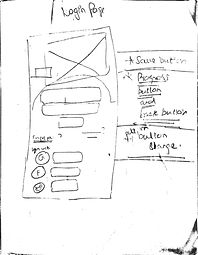
Paper Wireframe
Wireframing with white paper is too good to implement our idea the second, while if we use the digital tool for primary wireframing it consumes much timing, for example, if we need to draw a rectangle, with the help of paper and pen we can draw at the sudden and if we use the digital tool it takes time to select the tool and go to the certain point on the page. Comparatively paper wireframing is time-efficient.
to view more

Digital Wireframing
DigitalWireframe is a Digital representation of the paperwork frame. The advantage of the digital wireframe are portable and transferable.We can present the digital representation of the wireframe in a digital meeting and we can get the critiques from each member of our team.
A wireframe is a two-dimensional illustration of a page's interface that specifically focuses on space allocation and prioritization of content, functionalities available, and intended behaviors.
Persona
Personas are fictional characters, which you create based upon your research to represent the different user types that might use your service, product, site, or brand in a similar way. Creating personas will help you understand your users' needs, experiences, behaviors and goals.
to view more
Hi-fi Prototype
A prototype is “A simulation or sample version of a final product, which UX teams use for testing before launch.” The goal of a prototype is to test and validate ideas before sharing them with stakeholders and eventually passing the final designs to engineering teams for the development process
Digital Prototype is a model without the working phase of the final product. This is the virtual product which has been hand overed as an final product to the engineers
to explore
.png)
Work Flow
The workflow defines how the each pages and button are navigated when a call to action proceeds.
UX flow is a diagram that shows the path a user goes through when using your product from the start point to the final interaction. You can have many User Flows as a part of a single project, as there are a lot of different objectives for a person that uses your service/ap

User Interactions
Blue - Colour choosing
The Blue color has been chosen, because it make the
people to make a clean vision. It is generally comfortable to all the genders .It is easy to adapt quick with blue than any other colors,
to know about blue in MEDIUM,.
Rounded edge - Choosing Shape
Designers use rounded corners so much today that they’re more of an industry standard than a design trend. Not only are they found on software user interfaces, but hardware product designs as well.
to know about edges in UX moment,.
Segoe UI - Choosing Font
Segoe UI is an approachable, open, and friendly typeface, and as a result has better readability than Tahoma, Microsoft Sans Serif, and Arial.
to know about font in DESIGN MODO,.
Hierarchy
Hierarchy is a visual design principle which designers use to show the importance of each page/screen's contents by manipulating these characteristics: Size – Users notice larger elements more easily. Color – Bright colors typically attract more attention than muted ones
to know about VISUAL HIERARCHY in MEDIUM,.


Corrections Done
I had done these project with the purple shade.
After making the testing with few users , they feel the prototype feels too dark.
Dark theme made the users to feel the visual design too complicated .And made them Uncomfortable to navigate the buttons and affects the target task given to them.
.jpeg)


